Measuring Operational Efficiency for Growth
- GrowthBI

- Jul 18, 2025
- 9 min read
Updated: Jul 31, 2025
Measuring operational efficiency is about understanding how well your business uses its resources like time, people, and materials to deliver value to customers. Consider it a diagnostic tool that helps identify and eliminate waste, optimize workflows, and strengthen your financial position. For many leaders, this is the key to moving beyond reactive cost-cutting and building a resilient company.
Why Measuring Operational Efficiency Drives Growth
Monitoring operational performance is essential. For founders or CEOs of mid-size companies, inefficient processes quietly erode profitability and the ability to scale. Without clear metrics, you are operating without visibility, constantly reacting to problems instead of proactively managing the business.
When you implement a systematic approach to tracking performance, you gain the insight needed to make decisions. The conversation shifts. Instead of different departments assigning blame, everyone can look at the same data and collaborate to solve underlying process issues. This is vital in industries like construction, SaaS, and manufacturing, where margins are often thin and workflows are complex.
In addition to internal challenges, external pressures can complicate matters. For example, recent reports show that 71% of Australian businesses expect workforce shortages to affect their operations. These gaps disrupt workflow and hurt productivity, making it more important than ever to optimize the resources you have. You can explore these trends in the full Australian industry outlook.
Ultimately, creating a framework to assess your operational health is the foundation for building a more adaptive organization. It provides the foundation for better reporting, faster decisions, and an aligned team.
How to Choose the Right KPIs for Your Industry
Selecting the right Key Performance Indicators (KPIs) is critical. If you choose incorrectly, you will track metrics that appear positive but do not contribute to your bottom line. It is easy to get lost in data, but the solution is to focus on numbers that reflect how your specific business operates.
For any growing company, this requires looking beyond high-level financials. You need to connect your team's daily activities with your overarching business goals.
Match Your Metrics to Your Business Model
It seems obvious, but many fall into this trap: the KPIs that are important for a software-as-a-service (SaaS) company are very different from those for a construction firm. Your metrics must reflect your operational reality.
Let’s be specific.
For SaaS Companies: You are focused on long-term customer acquisition and retention. You need to know if your growth is sustainable. A key KPI here is Customer Acquisition Cost (CAC) Recovery Time. It tells you exactly how many months it takes for a new customer's revenue to repay the cost of acquiring them. Another crucial metric is Net Revenue Retention (NRR), which shows how much your revenue grows or shrinks from your existing customers alone.
For Construction Companies: The goal is to deliver projects on time and within budget. That is why Project Margin Variance is non-negotiable; it is a direct comparison of your planned profit versus your actual profit. You should also monitor your Equipment Utilization Rate. Expensive machinery needs to be productive.
For Manufacturing Companies: Here, it is about producing more with less waste and downtime. Overall Equipment Effectiveness (OEE) is the standard. It is a composite metric that combines machine availability, performance, and quality into a single score. Tracking Production Downtime is also vital for identifying bottlenecks or failing equipment before they cause major disruptions.
These are just a few examples. For a more extensive list, see our guide to the top operational KPI examples for business success.
To make this clearer, let's compare these industry-specific KPIs side-by-side.
Industry-Specific Operational Efficiency KPIs
Industry | Primary KPI | What It Measures | Supporting Metrics |
SaaS | Net Revenue Retention (NRR) | Revenue growth from existing customers, accounting for upsells & churn. | Customer Lifetime Value (CLV), Churn Rate, CAC Recovery |
Construction | Project Margin Variance | The difference between the planned profit and the actual final profit. | Equipment Utilization, Labor Productivity, Rework Costs |
Manufacturing | Overall Equipment Effectiveness (OEE) | The combined impact of machine availability, performance, and quality. | Production Downtime, Scrap Rate, First Pass Yield |
Choosing the right primary KPI provides a clear signal, while supporting metrics help you diagnose the root cause when performance deviates.
The goal is to find the vital few that provide an unfiltered view of your operational health and point toward specific actions.
This chart is a good example for a manufacturing context, showing how different metrics like output, resource use, and downtime are all connected.
This visual shows that high resource utilization does not automatically mean you are efficient. If your downtime is also high, it is a red flag that requires further investigation to understand the real situation.
Finally, you must connect these KPIs back to your broad business objectives. If your company's main goal for the year is to increase profitability, then metrics like Project Margin Variance or OEE become your direct progress report. This alignment transforms measurement from a reporting task into a powerful tool for management that allows you and your leadership team to have productive conversations about what is working and what needs to change.
Building a System for Reliable Data Collection
You can have the most brilliant KPIs, but they are misleading if built on unreliable data. For most mid-sized businesses, the problem is that the data is disorganized.
First, you need to identify where your most important data resides. Get a clear picture of the primary systems holding the information needed for your KPIs. It is usually a combination of a few key systems:
Enterprise Resource Planning (ERP) systems: The home of your financial and supply chain data.
Customer Relationship Management (CRM) software: Holds your sales and customer interaction history.
Project management tools: Tracks project timelines, resource allocation, and key deliverables.
Machinery sensors or IoT devices: Essential for capturing production and equipment data in sectors like manufacturing.
Once you have mapped your sources, the goal is to bring them together. This does not need to be a massive, multi-year IT project. Modern integration tools can connect these different systems, funneling essential information into a central data warehouse. This gives you a foundation of any serious effort to measure operational efficiency.
When everyone works from the same verified data, the conversation changes. You stop arguing about whose numbers are right and start collaborating on how to solve the actual business problems.
Automate Your Way to Accuracy
Automating your data collection is one of the most powerful changes you can make. When information flows directly from your source systems into your central data hub, you nearly eliminate the risk of human error associated with manual data entry.
It also frees up your team. Instead of your most capable employees wasting their days on manual data tasks, they can focus on analyzing insights and finding ways to improve the business. This idea is central to making broader improvements, which you can read more about in our article on how to streamline business processes for efficiency.
With rising costs and a tight labor market, Australian companies are turning to technology to boost their operational efficiency in 2025. Business leaders have prioritized productivity, and smart automation is a key strategy for sustainable growth. You can find out more about these Australian business technology trends on maxsum.com.
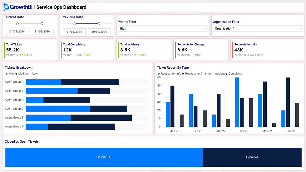
Designing Dashboards That Guide Decisions
Once your data is flowing reliably, you need dashboards that turn numbers into action. A good dashboard takes complex information from your systems and shows you what's really driving performance.
Tailoring Views for Different Leaders
Not everyone on your leadership team cares about the same things. A dashboard that tries to be everything to everyone is often useful to no one. The secret to great design is understanding the unique needs of each leader.
For example, your approach needs to be completely different for these two roles:
The CEO’s View: The CEO needs a high-level view. Their dashboard should be a snapshot focusing on big-picture metrics that show the overall health of the business. Think consolidated profit margins, cash flow, and progress against annual targets. It should answer one question instantly: "Are we on track?"
The Operations Manager’s View: This is where the detail resides. An operations manager needs to manage day-to-day activities. Their dashboard needs to be packed with specific operational KPIs. If they are in manufacturing, they will be watching Overall Equipment Effectiveness (OEE) and production line output. For a construction project manager, it is all about labor productivity and project budget variance.
This role-based approach cuts through the noise. It gives each leader exactly the information they need to do their job, without drowning them in irrelevant data.
Key Principles for Effective Dashboard Design
Building a dashboard people will use comes down to a few core design principles. The goal is to make the information so intuitive that it sparks conversation and aligns everyone quickly.
Prioritize Clarity Over Density: It is tempting to cram every metric onto one screen. Avoid this. Use white space to guide the eye and group related metrics. A cluttered dashboard creates confusion and hides the trends you are trying to find.
Use Clear Visualizations: Pick the right tool for the job. Bar charts are excellent for comparisons, line charts are perfect for showing trends over time, and large, bold number cards are ideal for highlighting your most critical KPIs.
Provide Context to Numbers: A number by itself is meaningless. A figure like 75% needs context. Is that good or bad? Always add context by comparing current performance to a target, the previous month, or the same time last year. That context transforms raw data into genuine insight.
A well-designed dashboard tells a story about your business performance, showing you where you are, where you have been, and where you are headed.
By adhering to these principles, you can create reports that unite your entire team around a shared understanding of performance. For some real-world inspiration, check out our collection of KPI dashboard examples designed to drive decisions. This focused approach ensures your reporting efforts lead directly to a more informed discussions and better strategic planning.
How to Read the Signs and Drive Real Change
Having a dashboard full of data is a good start. The real value comes when you use that information to make meaningful changes in your business. It is about moving beyond simply observing the numbers and learning to read between the lines to genuinely improve your operational efficiency.
Dashboards are excellent at showing you what is happening. For example, a SaaS company might see a sudden 15% drop in its customer engagement metric three weeks after a group of new users onboard. The dashboard flags a problem, but it will not tell you why it happened. This is where your expertise comes in; it is time to ask the right questions.
This is the moment you shift from spectator to investigator, a crucial skill for any leader serious about improving performance.
A Practical Framework for Digging Deeper
When a KPI moves in the wrong direction, the immediate reaction is often to find a quick fix. But that approach usually addresses symptoms. A better method is to use a simple framework to uncover the root cause.
Let's return to the SaaS company with the declining engagement. Instead of panicking, the leadership team could work through a few specific questions to understand the issue:
What exactly changed? Did engagement drop for all new customers? Or was it just a specific group, like those on a new subscription plan or from a particular industry?
When did the change happen? Identifying the exact date can help you connect the drop to a specific event. Was there a software update? A change in the onboarding process?
Where is the friction point? Is the drop-off happening immediately after onboarding, or when users try to access a specific feature for the first time?
Why might this be happening? This is where you form hypotheses. Perhaps the latest update introduced a bug. Maybe the new onboarding guide is confusing.
By methodically asking these questions, you transform a vague problem like "low engagement" into a specific, solvable one like, "new enterprise customers are not completing the setup for our advanced reporting feature." This clarity is essential for taking effective action.
Weaving Data Into Your Company's DNA
You will know you have truly mastered operational efficiency when this type of analysis becomes second nature in your organization. It is about building a culture where teams regularly check performance, identify areas for improvement, and make adjustments based on solid data.
This means making your dashboards a central part of operational meetings. Teams should use them to guide discussions, hold themselves accountable, and track the results of their initiatives.
You want to create a powerful feedback loop. You use data to spot an issue, analyze its root cause, implement a change, and then measure the impact. This cycle is what turns your data from a static report into a dynamic engine for continuous improvement and lasting business growth.
At GrowthBI, we build the custom Power BI dashboards and data platforms that give leadership teams the clarity they need to drive performance. Learn how we can help your team make smarter decisions by visiting our website.


