Top Operational KPI Examples for Business Success
- GrowthBI

- Jul 15, 2025
- 11 min read
Updated: Aug 8, 2025
In business, what gets measured gets managed. Without the right metrics, your company’s operational performance remains a mystery, driven by gut feelings rather than data. This lack of clarity often leads to inefficient processes, hidden costs, and missed growth opportunities. The cost of a poor data setup is the cumulative effect of slow decisions, misaligned teams, and reactive problem-solving that holds your organization back.
This article provides a curated list of essential operational KPI examples designed for senior decision-makers. We will move beyond basic definitions to show you exactly how to implement, analyze, and act on these metrics. Each example includes specific formulas, use cases, and practical tips for integrating them into a business intelligence (BI) dashboard. By the end, you will have a clear framework for measuring driving sustainable performance improvements across your organization.
1. Overall Equipment Effectiveness (OEE)
Overall Equipment Effectiveness, or OEE provides a view of how well a manufacturing operation is being utilized compared to its full potential during the periods when it is scheduled to run. OEE is a powerful metric because it consolidates complex production issues into a single percentage.
An OEE score of 100% represents perfect production: manufacturing only good parts, as fast as possible, with no stop time. For many businesses, particularly in manufacturing and construction, tracking OEE is fundamental for identifying performance losses and improving operational efficiency.
How to Calculate OEE
The OEE formula multiplies three key factors: Availability, Performance, and Quality.
Formula: OEE = Availability x Performance x Quality
Let’s break down each component:
Availability: This measures all events that stop planned production for a significant length of time. It accounts for unplanned stops, like equipment failure, and planned stops, like changeovers.
Formula: Availability = Run Time / Planned Production Time
Performance: This considers anything that causes the manufacturing process to run at less than its maximum possible speed. It includes slow cycles and small stops.
Formula: Performance = (Ideal Cycle Time × Total Count) / Run Time
Quality: This accounts for manufactured parts that do not meet quality standards. It includes parts that need reworking and those that must be scrapped.
Formula: Quality = Good Count / Total Count
Strategic Insight: The value of OEE lies in analyzing the three underlying components. A low Availability score points to maintenance issues, while a low Performance score might indicate training or process speed problems. Poor Quality scores often signal issues with raw materials or machine calibration.
Strategic Application and Dashboard Visualisation
To effectively use OEE, you must track it consistently and display it on a BI dashboard. This allows operations managers and executives to see performance trends in near real-time. For example, a construction company could use OEE to measure the uptime and output of heavy machinery like excavators or cranes.
Dashboard Implementation Tips:
Visualize Trends: Plot OEE, Availability, Performance, and Quality on a line chart over time (daily, weekly, monthly). This helps identify gradual declines or improvements.
Drill-Down Capability: Enable users to click on a low OEE score to see the individual component scores. This directs troubleshooting efforts to the right area immediately.
Set Clear Targets: A world-class OEE is typically considered 85% according to Lean Production. Set a realistic target for your organization and display it on the dashboard to benchmark performance.
By focusing on OEE as one of your primary operational KPI examples, you can systematically address the root causes of production loss, leading to increased capacity, reduced costs, and improved product quality.
2. First Pass Yield (FPY)
First Pass Yield, or FPY, measures the quality and efficiency of a process at its source. It calculates the percentage of units that pass a specific process step correctly on the first attempt.
For organizations in manufacturing, software development, and service delivery, FPY is a vital metric. A high FPY signifies a cost-effective process that delivers quality outcomes to the next stage or to the end customer. Tracking FPY is essential for identifying process weaknesses and driving continuous improvement initiatives.
How to Calculate FPY
The FPY formula focuses on the ratio of defect-free units to the total number of units entering a process.
Formula: FPY = (Number of Units Completed Correctly on the First Try / Total Number of Units Entering the Process) x 100
where:
Units Completed Correctly on the First Try: This is the count of products or service outcomes that meet all quality specifications without any form of rework.
Total Number of Units Entering the Process: This represents the total volume of all units, both good and bad, that started the process step during the measurement period.
Strategic Insight: FPY exposes the hidden costs of poor quality. A low FPY score indicates that significant resources are being wasted on rework. Improving FPY directly reduces the cost of goods sold (COGS) and frees up capacity and allows your team to produce more with the same resources.
Strategic Application and Dashboard Visualisation
To effectively leverage FPY, organizations must track it at individual process steps and display it on BI dashboards for operational teams. This visibility helps pinpoint the exact stages where quality issues originate. For instance, a software development company can track FPY for each stage of its coding and testing pipeline to identify which phase introduces the most bugs.
Dashboard Implementation Tips:
Process-Level Monitoring: Create bar charts or gauges on your dashboard showing the FPY for each key step in a larger process. This immediately highlights the weakest links in the chain.
Trend Analysis: Plot FPY as a line chart over time to monitor the impact of process improvements. A steady upward trend validates the effectiveness of quality initiatives.
Pareto Analysis for Defects: When FPY drops, use a Pareto chart to categorize the types of defects. This helps the team focus its problem-solving efforts on the most frequent failure modes, adhering to the 80/20 principle.
3. Inventory Turnover Ratio
The Inventory Turnover Ratio measures how many times a company has sold and replaced its inventory over a specific time period. This metric highlights the velocity at which products move from purchase to sale. A high ratio generally indicates strong sales or effective inventory management, while a low ratio could signal overstocking, poor sales, or obsolete stock.
For any business holding physical goods, this ratio is a direct reflection of operational efficiency and cash flow health. Efficiently turning inventory into revenue frees up capital that would otherwise be tied up in unsold goods. This makes it a critical measure for financial stability and operational performance.
How to Calculate Inventory Turnover Ratio
The formula for the Inventory Turnover Ratio compares the cost of the goods you have sold against the value of the inventory you held on average during that period.
Formula: Inventory Turnover Ratio = Cost of Goods Sold (COGS) / Average Inventory
where:
Cost of Goods Sold (COGS): This represents the direct costs attributable to the production of the goods sold by a company. It includes material costs and direct labor costs.
Source: Typically found on the company's income statement.
Average Inventory: This is the average value of inventory held over the period. It is calculated to smooth out seasonal fluctuations.
Formula: Average Inventory = (Beginning Inventory + Ending Inventory) / 2
Strategic Insight: A high turnover ratio is not always positive on its own. It could indicate insufficient stock levels. The key is to find the optimal balance that maximizes sales without overinvesting in inventory. This KPI should be analyzed alongside metrics like sell-through rate and customer service levels to get a complete picture.
Let's take a look at this visual:
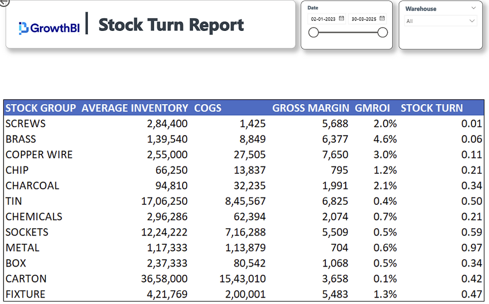
This Stock Turn Report helps users evaluate inventory efficiency by tracking average inventory, cost of goods sold (COGS), gross margin, GMROI, and stock turn across product groups. It highlights underperforming stock segments with low turnover or returns, enabling better inventory planning and cost control. The built-in filters for date and warehouse make the analysis flexible and tailored to specific periods or locations.
Strategic Application and Dashboard Visualisation
Tracking the Inventory Turnover Ratio on a BI dashboard allows operations to monitor inventory health. For example, a fast-fashion retailer might have a high inventory turnover as a core part of its business model, while a construction supplier might track turnover by product category to identify slow-moving items taking up valuable warehouse space.
Dashboard Implementation Tips:
Segmented Analysis: Visualize inventory turnover by product category, supplier, or location. A bar chart comparing turnover across these segments can quickly reveal top performers and problem areas.
Trend Monitoring: Use a line chart to plot the turnover ratio monthly or quarterly against historical data and industry benchmarks. This helps identify seasonal trends and performance gaps.
Correlate with Sales Data: Display the turnover ratio alongside sales volume and gross margin on the same dashboard. This correlation helps you understand the relationship between inventory speed, sales, and profitability.
4. Cycle Time
Cycle Time measures the total time required to complete one unit of work from start to finish. This includes all processing, waiting, and handling time involved in a process. Tracking Cycle Time is essential for identifying bottlenecks, improving customer satisfaction through faster delivery, and increasing overall capacity without adding resources.
How to Calculate Cycle Time
The calculation for Cycle Time is the total elapsed time from the beginning to the end of a process.
Formula: Cycle Time = Process End Time - Process Start Time
Let’s break down the components of time within this calculation:
Process Time: The time when a unit is actively being worked on. This is value-added time.
Wait Time: The time a unit spends waiting for the next step, such as waiting in a queue for a machine or for an approval. This is non-value-added time.
Move Time: The time spent physically moving the unit between different process steps.
Inspection Time: The time allocated to quality control and checking the work.
Strategic Insight: The majority of Cycle Time in most processes is non-value-added wait time. Focusing on eliminating these waiting periods offers the greatest opportunity for improvement. A low Cycle Time directly correlates with higher throughput and improved responsiveness to customer demand.
Strategic Application and Dashboard Visualisation
To effectively manage Cycle Time, it must be visualized on a BI dashboard. For instance, a construction company can monitor the cycle time for key phases like foundation laying or frame erection to better manage project timelines.
Dashboard Implementation Tips:
Process Stage Breakdown: Use a stacked bar chart to show the average Cycle Time broken down by its components (Process Time, Wait Time, etc.). This immediately highlights where the delays are occurring.
Trend Analysis: Plot the average Cycle Time on a line chart over weeks or months to track the impact of process improvements. Setting a target line on the chart provides a clear performance benchmark.
Outlier Identification: A scatter plot or box plot can help identify individual work items with unusually long Cycle Times. This enables teams to investigate specific causes of delay. For more information, you can learn how to streamline business processes for efficiency.
5. Order Fulfillment Rate
Order Fulfillment Rate, sometimes called the Perfect Order Rate, measures the percentage of customer orders filled completely. This operational KPI is a direct indicator of supply chain performance and its ability to meet customer expectations. It provides a holistic view of the entire order-to-delivery process.
A high fulfillment rate is crucial for any business that ships physical goods, particularly in competitive e-commerce, retail, and manufacturing sectors. It directly impacts customer satisfaction, loyalty, and brand reputation. For operations managers, this metric reveals the health of their warehousing, picking, packing, and shipping processes.
How to Calculate Order Fulfillment Rate
Order Fulfillment Rate calculates the proportion of perfect orders against the total number of orders.
Formula: Order Fulfillment Rate = (Number of Orders Fulfilled Perfectly / Total Number of Orders) × 100
A "perfectly fulfilled" order must meet several criteria simultaneously:
Complete: The order contains every item the customer requested.
Accurate: The items are the correct SKUs, and the quantity for each is correct.
On-Time: The order is delivered to the customer by the promised delivery date.
Damage-Free: The order arrives in perfect condition with no damage to the products or packaging.
Strategic Insight: A low Order Fulfillment Rate is a clear signal of underlying systemic problems. It forces a business to investigate specific failure points. Are orders late due to warehouse bottlenecks, inaccurate due to picking errors, or incomplete because of poor inventory management? Each failure points to a different operational weakness that requires a targeted solution.
Strategic Application and Dashboard Visualisation
Tracking Order Fulfillment Rate on a BI dashboard is essential for managing customer satisfaction and operational costs. For an e-commerce company, a consistently high rate, for example 98% or higher, can be a significant competitive advantage, while a dip can immediately flag issues that affect the bottom line.
Dashboard Implementation Tips:
Component Breakdown: Display the overall Order Fulfillment Rate, but also show the failure reasons. Use a bar or pie chart to categorize failures: e.g., 'Late Shipment', 'Incorrect Item', 'Damaged in Transit', 'Out of Stock'.
Trend Analysis: Plot the fulfillment rate on a line graph over time to monitor performance trends and the impact of process improvements.
Automated Alerts: Set up automated alerts for when the rate drops below a predefined threshold, such as 95%. This enables swift intervention. Integrating this with automated reporting systems can streamline communication and accelerate response times.
6. Cost Per Unit
Cost Per Unit measures the total expense incurred to produce one unit of a product or service. This metric provides a clear line of sight into production efficiency and profitability by encapsulating all direct and indirect costs, including materials, labor, and factory overhead.
The metric directly informs pricing strategies, budget allocations, and process improvement initiatives. A keen understanding of the Cost Per Unit allows leaders to pinpoint cost drivers and make strategic adjustments to protect margins.
How to Calculate Cost Per Unit
The accuracy of Cost Per Unit depends on an accounting of all relevant expenses.
Formula: Cost Per Unit = Total Production Costs / Total Units Produced
Let’s break down the components:
Total Production Costs: This includes all expenses related to the creation of goods or services. It is the sum of direct costs, like raw materials and direct labor, and indirect costs, like factory rent, utilities, and supervisor salaries.
Total Units Produced: This is the total number of goods or service units completed within the specified period. Consistency in defining a "unit" is critical, whether it is a physical product, a completed service call, or a software subscription.
Strategic Insight: The absolute value of your Cost Per Unit is less important than its trend over time and its comparison to industry benchmarks. A rising Cost Per Unit can be an early warning of supply chain disruptions. Focusing on the controllable elements within your costs allows you to actively manage and improve this crucial KPI.
Strategic Application and Dashboard Visualisation
Tracking Cost Per Unit on a BI dashboard allows managers to monitor efficiency in near real-time and react quickly to cost variances. For instance, a construction firm can track the cost per square meter built to evaluate project profitability and subcontractor performance.
Dashboard Implementation Tips:
Component Breakdown: Use a stacked bar or area chart to visualize the components of your Cost Per Unit (materials, labor, overhead). This immediately shows which cost category is driving changes.
Trend and Variance Analysis: Plot the Cost Per Unit on a line chart against a set target or budget. Add a secondary axis to show production volume, helping you identify economies of scale.
Benchmarking: Display your Cost Per Unit alongside industry or internal benchmarks. This provides crucial context and helps set realistic and ambitious performance targets for your teams.
By integrating Cost Per Unit into your operational reporting, you give your team a clear target for efficiency improvements.
Key Operational KPIs Comparison
KPI | Implementation Complexity | Resource Requirements | Expected Outcomes | Ideal Use Cases | Key Advantages |
Overall Equipment Effectiveness (OEE) | Moderate to High, needs accurate data systems and integration | Moderate, data collection and monitoring tools | Comprehensive equipment efficiency score; highlights areas for improvement | Manufacturing equipment & production lines | Holistic metric combining availability, performance, and quality; easy benchmarking |
First Pass Yield (FPY) | Moderate, requires real-time quality controls | Moderate, quality control systems and inspection | Improved product quality; reduced waste and rework costs | Production quality monitoring in manufacturing and services | Directly tracks defect-free output; early warning of process issues |
Inventory Turnover Ratio | Low to Moderate, uses existing inventory and sales data | Low, relies on accurate inventory and sales records | Measures inventory management efficiency; impacts cash flow | Retail, manufacturing, and supply chain management | Indicates demand forecasting effectiveness; reduces carrying costs |
Cycle Time | Moderate, needs time tracking across processes | Low to Moderate, time tracking tools or process observation | Faster throughput; identifies bottlenecks | Process improvement, capacity planning, and customer service | Improves operational speed; supports bottleneck identification |
Order Fulfillment Rate | Low to Moderate, tracking complete and on-time orders | Moderate, order processing and inventory monitoring systems | Higher customer satisfaction and loyalty | E-commerce, logistics, and retail order management | Combines accuracy and timeliness; directly impacts customer experience |
Cost Per Unit | Moderate to High, requires detailed cost accounting | Moderate to High, detailed cost data collection | Clear visibility of production costs and profitability | Pricing strategy, cost control, and budgeting | Facilitates cost reduction targets and profitability analysis |
The goal is to move beyond simply tracking metrics and toward building a data-driven culture. This is where every key decision, from capital expenditure on new machinery to hiring plans, is supported by clear information. A modern business intelligence solution transforms these individual operational KPI examples from static numbers into a dynamic narrative of your business's health. It automates collection and reporting that frees your team to focus on strategic analysis and execution. By building this foundation, you create a more profitable organization prepared for sustainable growth.
The experts at GrowthBI specialize in building custom Power BI dashboards that turn data from your operations into clear reports. Schedule a consultation with GrowthBI to see how you can achieve complete visibility across your most important KPIs.


