Your Essential Power BI Dashboard Guide
- GrowthBI

- Sep 4, 2025
- 9 min read
Modern organizations generate data from dozens of systems across departments. Sales data resides in CRM platforms, financial metrics live in ERP systems, marketing analytics span multiple digital platforms, and operational data exists in specialized industry applications. This distributed data architecture creates critical gaps in executive visibility and decision-making speed.
This fragmented approach to business intelligence costs time. While you're waiting for accurate data, competitors are making informed decisions in real-time. Microsoft Power BI emerges as a solution that transforms this reactive approach into a proactive strategy.
What Is a Power BI dashboard?
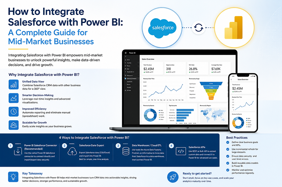
Power BI, developed by Microsoft as part of the broader Power Platform ecosystem, is a cloud-based business intelligence tool designed to transform raw data scattered across your organization into actionable insights.
A Power BI dashboard is an interactive screen that consolidates your critical business data into one place. It is designed to give you a live view of your company’s performance by integrating information from sales, finance, operations, and more. This ability to zoom from a high-level view to the ground level provides leaders the context needed to make informed strategic decisions.
What Is Power BI Dashboard Used For?
Organizations leverage Power BI dashboards across numerous strategic initiatives:
Financial Planning and Analysis: Transform budget spreadsheets into dynamic forecasting models that update automatically as actuals come in. CFOs can track cash flow, profitability by division, and variance analysis in real-time rather than waiting for month-end closes.

Dashboard wireframe created using mokkup.ai Sales Performance Management: Convert static sales reports into interactive dashboards that reveal not just what happened, but why it happened. Sales leaders can identify top-performing territories, forecast pipeline accuracy, and spot early warning signs of deals at risk.

Dashboard wireframe created using mokkup.ai Operational Excellence: Monitor key performance indicators across manufacturing, supply chain, and service delivery. Operations executives can identify bottlenecks before they impact customer satisfaction and optimize resource allocation based on real-time demand patterns.
Dashboard wireframe created using mokkup.ai Strategic Decision Support: Combine external market data with internal performance metrics to inform strategic planning. CEOs can evaluate market opportunities, assess competitive positioning, and measure the effectiveness of strategic initiatives with unprecedented clarity.
To get a better feel for what is possible, review some compelling financial dashboard examples that show how industries are visualizing their data.
The Strategic Benefits For Your Company
Beyond its technical capabilities, a Power BI dashboard delivers real-world business outcomes that support growth and create stability. A well-built dashboard is designed to solve common business problems. It drastically reduces the hours your team spends manually compiling reports. This shift to automation also lets you manage proactively by spotting trends and addressing issues before they become serious problems.
A Single Source Of Truth
Each department has its own version of reality that results in clashing priorities and meetings spent debating whose numbers are correct. A Power BI dashboard ends that problem. It pulls data from every corner of your business into one authoritative hub. The impact is immediate:
Improved Team Alignment: Everyone, from the C-suite to team leads, looks at the same set of numbers. This builds a shared understanding of what is working, what is not, and the company's direction.
More Productive Meetings: Conversations can jump straight to strategy and solutions with the data settled.
Increased Accountability: When metrics are clear and transparent, it is much easier to track progress against goals and hold teams accountable for their results.
Drive Concrete Business Outcomes
Adopting a Power BI dashboard is about achieving measurable gains for your business. Here are some of the key outcomes you can expect:
Cost Savings: Automating reporting can save hundreds of manual work hours every year, which directly cuts your operational overhead. You can learn more about how to start measuring operational efficiency for growth with better data.
Revenue Opportunities: By highlighting potential cross-sell or upsell opportunities and flagging at-risk customers, a dashboard helps you proactively protect and grow your revenue.
Improved Operational Efficiency: Real-time visibility into your operations, whether it is a supply chain, a project timeline, or patient flow in a clinic, allows you to fine-tune processes and use your resources far more effectively.
What Makes a Power BI Dashboard a Leaders Best Friend?
Forget static reports. A Power BI dashboard is a dynamic tool built to help you answer complex business questions quickly. For a leader, knowing how these features work means you can pull crucial insights on demand, whenever you need them.
The following table breaks down some of the most impactful Power BI features and how they directly apply to the daily realities of running a business.
Power BI Features for Executive Decision-Making
Feature | Business Application Example |
Real-Time Data Streaming | A retail CEO watching live Black Friday sales figures to adjust promotions in real time. |
Interactive Drill-Downs | A construction director clicking on an "over budget" figure to pinpoint which specific project and material is causing the overspend. |
Natural Language Q&A | A sales manager typing "Who are my top 5 reps this month?" and getting an instant chart as an answer. |
Automated Alerts | A CFO receiving an automatic email notification when accounts receivable over 90 days hits a critical threshold. |
Each of these tools allows you to move from simply observing performance to actively steering it. Let’s explore exactly how.
See Performance As It Happens With Real-Time Data
One of the most useful features for any leader is real-time data streaming. This function allows certain visuals on your dashboard to update the second new data arrives.
During a campaign promotion in your company, instead of waiting for hourly reports, you are watching sales, website traffic, and stock levels update live on your dashboard. You see a key product selling out much faster than expected. Instantly, you can direct your team to pivot marketing efforts towards another item.
This is the difference between reviewing history and actively shaping the present.
Dig Deeper With Interactive Drill-Downs
Your top-level numbers tell you what is happening, but they rarely explain why. This is where drill-down and drill-through capabilities are most valuable. It is a simple concept: you click on a data point in a chart to see the detail behind it.
Let's say a construction executive sees a chart showing project costs are 15% over budget. That is a concerning number, but it does not identify the source of the problem. With a drill-down, they can:
Click the "over budget" bar to see a breakdown of costs by project.
Instantly spot that one project is driving the entire overspend.
Click that project to see its costs split by labor, materials, and equipment.
Discover that material costs for that one site have doubled against the forecast.
A dashboard’s true strength is giving you the power to question it. The ability to explore data interactively lets you follow your own train of thought to find answers.
Get Answers in Plain English
Not every leader is a data analyst. The Natural Language Q&A feature is useful because it lets you ask questions of your data using everyday language. Instead of struggling with filters, you can just type a question into a search box, like:
"What were our top 5 products by sales last quarter?"
"Show me the year-over-year revenue growth for the healthcare sector."
"Which salesperson has the highest conversion rate this month?"
Power BI understands your query and provides the answer as an interactive chart. This simple feature makes data accessible to your entire leadership team. To go deeper on this, you can see how Power BI delivers clarity for executive decisions in our detailed guide.
Stay Ahead With Automated Alerts
Finally, you cannot watch your dashboard all day. Automated alerts are your personal monitoring system. You set the rules, and Power BI will automatically notify you via email or a mobile notification when a key metric crosses a threshold you have defined.
These alerts let you manage by exception so you are only pulled into the details when your attention is genuinely required.
How Different Industries Use Dashboards
A Power BI dashboard's real value is in how it can be shaped to fit the unique needs of a specific industry. The great advantage of a dashboard is its flexibility. While the specifics change, the goal is always the same: to deliver clarity that leads to faster decisions.
E-commerce Customer Behavior
For an e-commerce director, understanding current customer behavior is critical. A well-designed dashboard can map out the entire sales process. More importantly, it highlights the friction points that are causing lost sales.
An e-commerce dashboard would typically focus on metrics like:
Daily Sales and Conversion Rates: Are we hitting our targets today?
Average Order Value (AOV): How can we encourage customers to add another item to their cart?
Shopping Cart Abandonment Rate: Where exactly are people getting stuck and leaving?
By monitoring these numbers, a manager can instantly see if a new website feature is confusing customers or if a marketing promotion is successfully boosting AOV. This allows for quick adjustments that have a direct impact on the bottom line.
Construction Project Management
In construction, profitability depends on keeping complex projects on time and on budget. A dashboard built for this industry acts as a single command center. This unified view helps leaders track essential data points, including:
Budget vs. Actual Spend: Flagging projects that are beginning to exceed their budget.
Project Timeline Progress: Comparing the plan against reality.
Safety Incidents: Identifying high-risk sites to improve safety.
Resource Allocation: Making sure the right people and equipment are in the right place at the right time.
For a project manager, this means getting an immediate, top-down view of budgets, timelines, and resources across multiple sites. It is about spotting small problems before they escalate into expensive delays.
Healthcare Clinic Operations
A healthcare clinic manager constantly balances excellent patient care with operational efficiency. A Power BI dashboard provides a high-level view of the clinic's flow.
The dashboard would focus on metrics like patient throughput, appointment no-show rates, and average wait times for each practitioner. Visualizing this data helps a manager spot bottlenecks at check-in or decide when to bring in more staff during peak hours, ultimately improving how the clinic serves its community.
SaaS Business Growth
For a SaaS company, growth depends on attracting new customers without losing existing ones. A dashboard can bring together data from your CRM, billing system, and product analytics to create a complete picture of customer activity. You can find more examples in our article on 5 Finance Dashboards for Mid-Size Companies.
This helps leaders track crucial metrics like Monthly Recurring Revenue (MRR), Customer Acquisition Cost (CAC), and churn rate.
The demand for these tools is clear. In 2024, Australia's data analytics market was valued at AUD 2.00 billion and is poised for major growth. You can learn more about these data-driven trends in Australia at codewave.com.
Principles of an Effective Executive Dashboard
It is one thing to build a Power BI dashboard; it is another to build one that executives will actually use to guide the business.
For any leader, time is the most valuable commodity. A well-crafted dashboard respects that by putting the most critical information front and center, in a way that is instantly understood.
Follow the Five-Second Rule
The most important guideline for any executive dashboard is the five-second rule. A CEO or founder should be able to glance at it and, within five seconds, know the overall health of the business. It must immediately answer the big question: "Are we on track or off track today?"
Achieving this requires ruthless prioritization. Instead of flooding the screen with dozens of metrics, the main view should focus on a handful of crucial Key Performance Indicators (KPIs). These are the top-level numbers that genuinely define success for your organization, such as monthly recurring revenue, gross margin, or customer acquisition cost.
Design for Maximum Clarity
A clear visual hierarchy is essential. The most important information should be the most prominent, typically placed in the top-left corner where our eyes naturally start reading.
Here are a few practical design tips to keep in mind:
Use color with purpose. Colors like green and red should be used sparingly to show performance against a target. Using too many bright colors creates visual clutter and makes the dashboard harder to decipher.
Choose the right chart for the job. A line chart is ideal for showing a trend over time, while a bar chart is better for comparing different categories. The type of visualization you choose should fit the story your data is trying to tell.
Embrace white space. A cluttered dashboard is an overwhelming one. Giving elements room to breathe with plenty of white space makes the layout feel organized and much easier to digest.
A well-designed dashboard guides the user’s eye. It uses layout, size, and color to draw attention to the most significant insights, making the data's story obvious without conscious effort.
Context Is Everything
A number on its own is meaningless. Is $500,000 in monthly revenue good or bad? That depends on the context. A useful dashboard provides that crucial context right within the visuals.
You can do this in a few simple ways:
Comparisons to Targets: Show how current performance is tracking against your goals. Are you ahead of your quarterly revenue target, or falling behind?
Historical Comparisons: Place current data next to data from previous periods, like the same month last year or the previous quarter. This is excellent for spotting trends and understanding seasonality.
Inclusion of Forecasts: Displaying projected numbers alongside actuals gives you an early warning system if performance starts to drift off course.
By baking this context into every metric, the dashboard becomes a strategic instrument. It helps leaders see not just what is happening, but how that performance measures up against expectations.
Ready to Get Started?
Transform your organization's decision-making capability with an Power BI implementation tailored to your specific industry and business requirements. During our strategy session, we'll assess your current business intelligence maturity, identify immediate opportunities for improvement, and develop a roadmap for implementing Power BI that delivers measurable results. Schedule a consultation with our experts today.