Sales Analytics Dashboard Examples for CEOs and Senior Leaders
- GrowthBI

- Aug 14, 2025
- 6 min read
Effective sales teams run on data, but raw numbers are rarely useful. Spreadsheets filled with leads, pipeline values, and quota figures can create confusion. Without a clear way to interpret this information, leadership teams and sales managers struggle to make strategic decisions. Real value comes from transforming raw data into organized insights that highlight performance, identify bottlenecks, and reveal opportunities.
A well-designed sales analytics dashboard solves this problem directly. It centralizes key performance indicators into a single view that enables faster analysis and better team alignment. Instead of digging through reports, you get an immediate understanding of what is working and what is not. This article showcases practical sales analytics dashboard examples to guide your own business intelligence implementation. We will analyze different dashboards and break down their key metrics and strategic applications.
01. Lead Generation and Prospecting Dashboard

Target Audience: Sales Representatives, Business Development Representatives (BDRs), Sales Managers
This dashboard tracks the performance of prospecting and lead generation efforts. A manufacturing firm, for example, could use this dashboard to see that leads from trade shows convert at a higher rate than those from digital ads, prompting a budget reallocation. This clarity helps BDRs focus their outreach and allows managers to optimize resource allocation for maximum return.
Key Metrics
Number of leads generated per rep or team.
Lead source breakdown (e.g., inbound, outbound, referrals).
Conversion rates from lead to qualified lead (MQL to SQL).
Email open rates, click-through rates, and response rates for outreach efforts.
Total outreach attempts (calls, emails) and follow-up status.
Lead handoff efficiency between BDRs and Account Executives (AEs).
02. Pipeline Management and Sales Funnel Dashboard

Target Audience: Sales Directors, Account Executives, Revenue Operations Managers
This dashboard provides a comprehensive view of the sales pipeline. It helps teams track deal progress, forecast revenue, and optimize conversion rates. A SaaS company might notice deals consistently stall at the "Technical Demo" stage. This insight prompts leadership to provide better training for AEs or create more effective demo materials, directly addressing the bottleneck and shortening the sales cycle.
Key Metrics
Pipeline Value & Volume: Real-time tracking of total deal value and number of opportunities by stage.
Deal Stage Conversion Rates: Measures the percentage of leads moving from one sales stage to the next.
Sales Cycle Length: Average time deals spend in each stage to identify bottlenecks.
Forecast Accuracy: Compares projected sales against actual closed deals for better revenue prediction.
Win/Loss Analysis: Insights into reasons for won or lost deals to refine sales strategies.
These dashboards accelerate the delivery of business intelligence. This rapid deployment provides executives with the necessary tools for making informed decisions faster. You can discover how Power BI clarifies executive decision-making by leveraging these kinds of consolidated views.
03. Sales Performance and Quota Attainment Dashboard

Target Audience: Sales Representatives, Sales Managers, Sales Leadership
This dashboard tracks individual and team performance against sales targets and quotas. In a financial services firm, a sales manager can use this dashboard to identify that a top-performing rep excels at closing high-value deals with a specific client profile. This information can then be used to coach other reps and refine the team's overall sales strategy.
Key Metrics
Revenue vs. quota (individual, team, regional).
Closed deals by rep, team, or product line.
Win/loss ratio for deals.
Total revenue generated per month/quarter.
Comparison of top-performing vs. underperforming sales reps.
Deal value and frequency by customer segment.
By standardizing core sales reporting, operations teams can deploy a functional performance dashboard in hours. This frees up analyst time to focus on deeper questions.
04. Revenue Forecasting Dashboard

Target Audience: CFOs, Financial Planners, Sales Leaders
This dashboard projects future revenue streams by analyzing historical data and market trends. A construction company CEO, for example, could use this dashboard's scenario modeling to understand the financial impact of a potential materials cost increase. This allows for proactive budget adjustments and informed conversations with clients about project pricing.
Key Metrics
Forecast vs. Actual Revenue: Tracks projected revenue against actual results to refine forecasting models.
Revenue by Product/Service: Breaks down forecasted income by product lines, services, or regions.
Seasonality & Trend Analysis: Identifies recurring patterns and market shifts impacting revenue cycles.
Pipeline Influence: Integrates sales pipeline data to adjust revenue predictions based on deal probabilities.
Scenario Modeling: Simulates different business conditions (e.g., best case, worst case) to assess potential outcomes.
Dashboards like these empower teams to move from raw data to visual insights with minimal friction. The Looker Studio Report Gallery is an example of a platform that enables businesses to build momentum in their data analysis.
05. Account Management Dashboard

Target Audience: Account Executives (AEs), Sales Managers, Sales Operations
This dashboard focuses on account-level performance and opportunities for growth. An EdTech company could use an account management dashboard to monitor product usage within its key university clients. If usage drops, the account health score would decrease, triggering an automated alert for the AE to proactively engage the client, prevent churn, and identify potential upsell opportunities for other departments.
Key Metrics
Key account performance (revenue, engagement, renewals).
Account expansion opportunities (upsell/cross-sell potential).
Customer lifecycle stage (new, expansion, renewal).
Account health score (based on engagement, purchase history, and usage).
Opportunity pipeline by key account.
Win rates for opportunities within key accounts.
The key to such dashboards is connecting disparate datasets to reveal insights. Understanding the underlying data model is where you can solve complex data integration problems efficiently.
Sales Analytics Dashboard Examples Comparison
Dashboard Type | Key Business Questions Answered | Potential Business Impact |
Lead Generation & Prospecting | Which lead sources are most effective? Are BDRs hitting their outreach targets? How efficient is our lead handoff process? | Increased lead quality; Improved BDR productivity; Higher MQL-to-SQL conversion rates. |
Pipeline Management & Funnel | Where are deals stalling in our pipeline? What is our average sales cycle length? Is our forecast realistic based on pipeline health? | Shortened sales cycles; Improved forecast accuracy; Increased win rates through bottleneck resolution. |
Sales Performance & Quota | Who are our top performers? Are we on track to meet our quarterly quota? What are the common characteristics of our won deals? | Enhanced team motivation and accountability; Data-driven coaching and performance management. |
Revenue Forecasting | What is our projected revenue for the next quarter? How will market trends impact our sales? What is the financial outcome of different business scenarios? | Improved strategic planning and budget allocation; Increased investor confidence; Proactive risk management. |
Account Management | Which of our key accounts are at risk of churn? Where are our biggest upsell/cross-sell opportunities? What is the lifetime value of our customers? | Reduced customer churn; Increased expansion revenue (upsells/cross-sells); Higher customer lifetime value. |
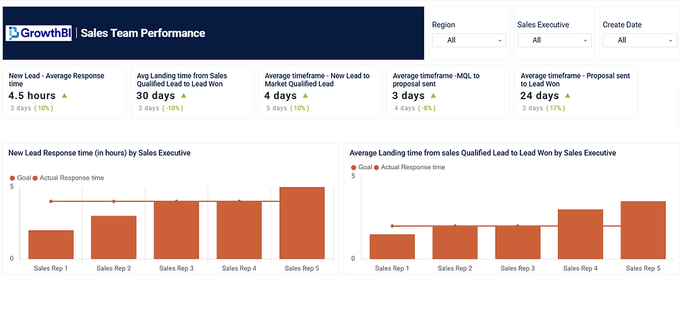
Let's take a look at the This Sales Team Performance view helps track the efficiency of the sales process by monitoring response times and conversion timeframes across key funnel stages. It highlights performance trends, compares individual sales reps against set goals, and identifies where delays occur—enabling managers to pinpoint training needs, reward top performers, and optimize the lead-to-win cycle.
Implementing a Data-Driven Sales Culture
Throughout this article, we have explored a diverse range of sales analytics dashboard examples. The common thread connecting these powerful tools is their ability to transform raw sales data into a clear assets.
The examples from platforms like Power BI, Tableau, and Looker Studio demonstrate a crucial principle: effective dashboards are more than just collections of charts. They are purpose-built instruments tailored to specific business questions.
Key Takeaways for Senior Leaders
Building a truly data-driven sales culture demands a strategic shift in how your organization approaches its core operations.
Start with the "Why": Before choosing a tool or designing a dashboard, clearly define the business problems you need to solve. Are you struggling with forecast accuracy? Is your sales cycle too long? Answering these questions first ensures your dashboards provide real solutions.
Focus on Action: Each metric on your dashboard should prompt a specific action. If the Lead Source Breakdown shows poor performance from a particular channel, the next step is to investigate or reallocate resources. A dashboard's value is measured by the quality of decisions it inspires.
Promote Data Literacy: Your team must understand how to interpret the data presented. Invest in training to ensure everyone, from sales reps to senior leadership, can read the dashboards and connect the metrics to their daily activities and strategic goals.
Moving forward, the goal is to implement these concepts within your own business context. Begin by auditing your current sales reporting processes. Identify the most critical gaps in your visibility and prioritize the dashboards that will deliver the most immediate impact. Review the examples we have covered and consider which layouts and key metrics best align with your top strategic objectives.
Selecting the right business intelligence platform is a critical step. Consider factors like your existing tech stack, the technical expertise of your team, and your budget. By following this structured approach, you can successfully integrate these powerful sales analytics dashboard examples into your operations and foster a culture where data consistently drives growth.
Ready to move from examples to implementation? The team at GrowthBI specialises in building customised sales and finance dashboards that connect directly to your business goals. We help you unify your data and create the clarity your leadership team needs to make strategic decisions with confidence. Explore how GrowthBI can help you build your data-driven advantage.


