Data Visualization Best Practices: 9 Key Tips for 2025
- GrowthBI

- Sep 2, 2025
- 11 min read
Data visualization done right accelerates decision-making from days to minutes. Every day, mid-sized companies generate massive amounts of data: sales figures, customer metrics, operational KPIs, financial reports. Companies have plenty of data but lack clarity.
Market leaders share one critical capability: they transform raw numbers into instant understanding. When your executive team can glance at a dashboard and immediately spot opportunities, threats, and trends, decision-making accelerates from days to minutes.
This guide reveals nine tested practices that have helped companies turn their business intelligence into a genuine competitive advantage.
You will have a complete framework for building dashboards that drive action. Your leadership team will move from information overload to confident execution.
1. Choose the Right Chart Type for Your Data
The foundation of effective data visualization is selecting a chart that aligns with your analytical goal. The right chart makes the intended message immediately clear. This alignment is a critical first step in creating dashboards that support rapid, informed decision-making.
Why It Matters
The primary purpose of a chart is to tell a story with data. The visual format you choose dictates how that story is told. For example, a line chart is excellent for showing continuous data over time. Conversely, a bar chart excels at comparing distinct categories. Using a pie chart to show time-series data would obscure the very trend you want to highlight.
A well-chosen chart reduces the cognitive load on the viewer. It allows executives to grasp the core message in seconds which translates directly into faster analysis and more confident decisions.
How to Implement This Practice
Follow a simple framework to match your data to the right chart:
For Comparison: Use bar charts to compare values across different categories. For example, an e-commerce director can use a bar chart to compare conversion rates from various marketing channels.
For Trends Over Time: Use line charts to display how a metric changes over a continuous period. For example, a financial controller might use a line chart to track cash flow on a weekly basis.
For Part-to-Whole Relationships: Use pie charts or stacked bar charts sparingly to show the composition of a whole. For example, an HR director could use a stacked bar chart to show the departmental breakdown of the company's total headcount.
For Correlation: Use scatter plots to show the relationship between two different variables. For example, a supply chain manager could use a scatter plot to analyze the relationship between shipping costs and delivery times.
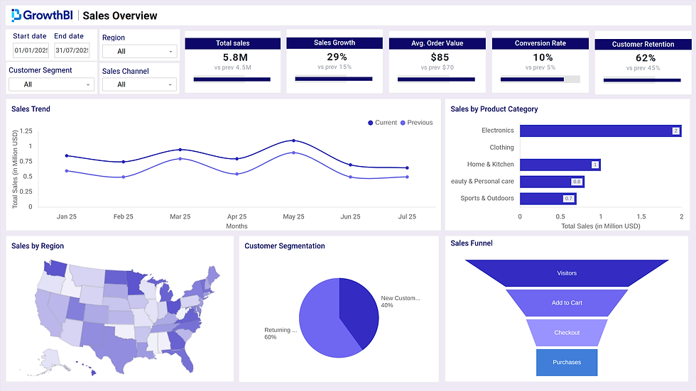
Look at one such example below that covers most chart types as visual requirement
By consciously selecting the chart type that best represents your data’s story, you build a foundation for clearer communication and a more effective reporting culture. This is one of the most fundamental data visualization best practices for any organization.
2. Maintain High Data-Ink Ratio
Popularized by data visualization pioneer Edward Tufte, the data-ink ratio principle is about maximizing the ink used to present actual data while removing anything that is purely decorative. This approach creates clean charts by eliminating non-essential elements like heavy gridlines, unnecessary borders, and 3D effects. The goal is to make the data itself the hero of the visualization.
Why It Matters
Every non-data element on a chart, often called "chartjunk," increases the cognitive load on your audience. It forces their brains to work harder to filter out noise and find the key message. For an executive team reviewing a monthly performance dashboard, this friction can slow down analysis and introduce ambiguity. By adopting a high data-ink ratio, you present information with precision. This allows leaders to absorb insights quickly and make decisions with greater confidence and clarity. This principle is a cornerstone of effective data visualization best practices.
A high data-ink ratio focuses the viewer’s attention exclusively on the data’s story. This sharpens the visualization's impact and accelerates comprehension for busy decision-makers.
How to Implement This Practice
Question every visual element on your chart and remove anything that does not directly serve the data. This ‘less is more’ approach extends to written descriptions. Mastering conciseness in communication is vital for reducing cognitive load in text just as it is for visuals.
Remove Unnecessary Gridlines and Borders: If a gridline isn’t essential for comparing specific data points, remove it or lighten its color to push it into the background.
Eliminate 3D Effects and Shadows: These effects distort data perception and add visual clutter without providing any analytical value. A sales manager needs to see an accurate comparison of regional performance, not a stylized, potentially misleading 3D bar chart.
Use White Space Effectively: Generous white space helps to frame the important data, guide the viewer’s eye, and give the visualization a clean, professional look.
Mute Non-Data Elements: Use light grey for axes, labels, and tick marks. This makes the data, represented in a more saturated color, stand out clearly.
3. Use Color Strategically and Accessibly
Color usage is a powerful tool for communication. When applied purposefully, color can highlight key data points, group related information, and guide the viewer’s attention. This functional approach helps color enhance understanding rather than distract from the core message of the data.
Why It Matters
Color acts as a silent narrator in your data story. Used effectively, it directs focus and clarifies meaning instantly. For example, using a bright accent color on a bar chart draws immediate attention to the highest-performing sales region. Conversely, a chaotic mix of vibrant colors can create visual noise which ovewhelms the viewer and making the chart difficult to interpret. Thoughtful color choice also promotes accessibility, so insights are available to everyone, including individuals with color vision deficiencies.
Good color strategy turns aesthetics into function. It guides the executive eye to make dashboards more intuitive and accelerating the time it takes to reach a critical insight.
How to Implement This Practice
Adopt a functional and inclusive approach to color in your visualizations:
Use Color to Emphasize: Apply a saturated color to highlight the most critical data point in a chart, while using neutral greys for the rest.
Maintain Consistency: Assign specific colors to specific categories and use them consistently across all related charts in a report or dashboard.
Design for Accessibility: Use palettes designed to be distinguishable by people with colorblindness. Also, avoid relying on color alone by using labels, icons, or patterns to convey information.
Leverage Conventions: Use colors that have intuitive meanings, like red for deficits and green for gains in financial reports, or a blue-to-red scale for temperature on a map.
4. Keep It Simple and Clear
The most powerful visualizations are often the simplest. This principle centers on creating charts that communicate a clear message without overwhelming the audience. It involves removing all non-essential elements, limiting the data presented, and focusing on a single, primary insight per visualization.
Why It Matters
Complex charts filled with unnecessary colors, gridlines, and data series create cognitive friction. They force the viewer to work hard to find the main point. This increases the risk of misinterpretation or having the insight missed entirely. A clean chart immediately highlights the problem area and enables swift intervention.
How to Implement This Practice
Adopt a minimalist approach to remove distractions and clarify your message:
Limit Data Series: Restrict your chart to a maximum of 5-7 data series.
Use Descriptive Titles: Write a title that summarizes the key finding. Instead of "Monthly Sales," use "Sales Grew 15% in Q3, Driven by the New Product Line."
Declutter Rigorously: Remove unnecessary borders, gridlines, and decorations. Every element on the chart must serve a specific purpose in communicating the data.
Leverage White Space: Use empty space to guide the viewer’s eye and create a clean, organized layout that is easy to scan.
5. Tell a Clear Data Story
Data storytelling transforms raw information into a compelling narrative that guides your audience through key insights. It is the practice of structuring visualizations with a clear beginning, middle, and end. This approach uses context and annotations to connect data points to meaningful business outcomes.
Why It Matters
Numbers and charts alone lack context. A narrative framework provides that context. It turns a passive dashboard into an active tool. For instance, an operations manager can present a series of charts that not only show a rise in production costs but also explain the "why" behind the trend, such as rising material prices or equipment downtime.
How to Implement This Practice
Adopt a structured approach to build a narrative around your data:
Establish a Narrative Arc: Start by setting the scene with relevant context (the beginning). Present the core findings and key insights (the middle). Conclude with specific recommendations or actions to be taken (the end).
Use Annotations: Add text callouts directly onto your charts to highlight critical points, outliers, or significant shifts.
Connect Data to Audience Goals: Always frame your findings in the context of what your audience cares about. Instead of just showing a decline in customer retention, explain how that decline impacts Monthly Recurring Revenue, a metric the CEO is closely monitoring.
Effective data storytelling bridges the gap between analysis and action. It helps executives understand its implications and feel compelled to respond.
Building a narrative is a core component of effective reporting and is one of the most powerful data visualization best practices. You can learn more about how storytelling fits into a wider strategy when you implement business intelligence.
6. Ensure Proper Scale and Proportions
The integrity of a data visualization hinges on accurate scaling. Proper scaling means the visual elements in a chart proportionally represent the underlying data. This practice is crucial for maintaining trust in your reporting and for presenting an honest view of performance.
Why It Matters
Manipulating a chart's scale can dramatically alter the story the data tells. For instance, a bar chart with a Y-axis that starts at 50 instead of 0 will exaggerate small differences, which makes minor fluctuations look like major events. A marketing director might misinterpret a 2% increase in campaign performance as a massive success. Honest scaling builds credibility and supports objective analysis.
How to Implement This Practice
Adopt a disciplined approach to setting scales and axes in your dashboards:
For Magnitude Comparisons: Always start the axis for bar charts at zero. This preserves the visual integrity of the data.
For Volatile or Exponential Data: Use a logarithmic scale when appropriate. A financial controller tracking stock performance over several years can use a log scale to better visualize percentage changes rather than absolute values.
For Dashboard Consistency: Maintain a consistent scale for related charts presented together. An operations manager viewing dashboards with metrics for different regions should see them on the same scale for a fair, side-by-side comparison.
For High-Density Data: Clearly label any truncated axes if you must use them. While not ideal, sometimes truncating an axis is necessary to show fine-grained variations in data with very high values. Transparency is key.
Accurate proportions provide the context needed for sound judgment. When executives trust that the visuals faithfully represent the numbers, they can make decisions with greater confidence and speed.
7. Optimize for Your Audience and Context
The most technically sound visualization can fail if it does not resonate with its intended audience. Audience-centered design involves tailoring your charts and dashboards to match the expertise, time constraints, and decision-making needs of your viewers.
Why It Matters
A chart’s value is determined by its utility to the end-user. An executive team needs high-level, summary KPIs to make decisions quickly, while a data analyst requires granular detail to investigate performance anomalies. Presenting an analyst-level view to a CEO will overwhelm them with unnecessary data. A high-level summary will frustrate an analyst trying to find root causes. Understanding the context, from the viewer's data literacy to the device they use, is critical.
A visualization designed for its specific audience feels intuitive and immediately useful. It respects the viewer's time and cognitive limits. It makes the data serve its purpose: to inform and empower a specific decision.
How to Implement This Practice
Adopt an audience-first approach when designing your visualizations:
For Executives: Focus on high-level KPIs and trends. Use simple charts, clear labels, and summaries that directly address questions.
For Analysts: Provide detailed data with options for filtering and drill-downs. Use more complex charts like scatter plots or heat maps that allow for deeper exploration.
For General Audiences: Use simple language, familiar analogies, and clear visual cues. Avoid jargon and focus on the core message. A public health report, for instance, should use universally understood icons and colors.
8. Provide Adequate Context and Metadata
To transform raw figures into meaningful business intelligence, you must provide the essential background information that allows your audience to understand what they are seeing. This includes details like data sources, time periods, and any known limitations.
Why It Matters
Contextual metadata is the foundation of trust and accurate interpretation in data visualization. It answers the crucial "who, what, when, where, and how" behind the numbers. For instance, a chart showing a sudden spike in website traffic is useful. However, knowing it coincided with a major marketing campaign launch provides the critical context for a marketing director to assess campaign ROI. Without this information, viewers might draw incorrect conclusions.
Providing clear metadata prevents misinterpretation and builds confidence in the data. It empowers executives to understand their reliability and relevance.
How to Implement This Practice
Incorporate contextual details directly and unobtrusively within your dashboards:
Label Clearly: Always include a title that describes what the chart shows. Add subtitles or footnotes to specify the date range, units of measurement, and data source (e.g., "Source: Google Analytics, 1 Jan - 31 Mar 2024").
Explain Anomalies: If there are outliers or unusual data points, use annotations to explain them. For example, a note on a sales chart could clarify that a dip was due to a public holiday.
Disclose Limitations: Be transparent about the data’s scope.
Standardize Definitions: Make certain key metrics are defined consistently across all reports. For instance, a "lead" should mean the same thing to both the sales and marketing teams.
9. Design for Multiple Devices and Formats
Responsive design is essential for modern dashboards. Visualizations must be clear and functional across different screen sizes, resolutions, and output formats. This practice makes certain that whether a director views a chart on a large monitor, a mobile phone, or a printed report, the data remains readable and fully interactive.
Why It Matters
Decision-makers access information from various locations and on multiple devices. If a visualization is unreadable or distorted on a smaller screen, its value is completely lost. Designing for adaptability guarantees that critical insights are always accessible, regardless of the viewing context.
A responsive visualization maintains its integrity and impact everywhere. This adaptability supports a flexible work culture and allows leaders to make informed decisions anytime.
How to Implement This Practice
Adopt a "mobile-first" or adaptive mindset when creating visualizations:
For Mobile Viewing: Prioritize simplicity. Use larger fonts, ample white space, and touch-friendly interactive elements.
For Desktop Displays: Utilize the larger screen real estate to show more detailed views or multiple related charts.
For Print or PDF Exports: Use high contrast and avoid relying on interactive features like tooltips that will not function in a static format. Annotate key data points directly on the chart so the context is preserved when printed for a board meeting.
Building a Foundation for Data-Driven Leadership
Mastering the nine data visualization best practices outlined in this article is about fundamentally changing how your organization interacts with information.
The principles we have explored are interconnected components of a single objective: to deliver clarity. When your leadership team can instantly grasp the meaning behind the numbers, their capacity for action improves significantly.
Adopting these standards requires discipline. Your team must consistently prioritize the audience's needs, provide essential context, and design for accessibility and simplicity. The most effective way to implement these practices is to embed them into your reporting systems and organizational workflows. This involves standardizing how you present information across all departments.
By treating data visualization as a core business competency, you transform data from a passive resource into an active asset. The goal is to build a foundation where every key decision is informed by clear, accurate, and timely insights. This approach empowers your leaders to navigate complexity with greater certainty and drive your business toward intelligent growth.
Transforming your company’s raw data into a clear advantage requires expertise. GrowthBI specializes in building customized business intelligence systems for mid-sized Australian companies. Book a consultation with our experts to see how we can help you build your data-driven foundation.

